They say it’s what’s on the inside the counts—except, of course, when you are a book cover, and your entire existence relies on looking pretty and being judged.
That’s right, folks. You know it, you love it. We here at Electric Lit have once again asked our lovely followers on Instagram and Twitter to vote between UK and US book covers to determine which trends are hot and which are so last year. Is the blob back with vengeance? Is photorealism still a thing? Will maximalism finally supersede minimalism? Is realism hanging on by the skin of its teeth?
We here at Electric Lit consider these all very important questions worthy of the utmost research, and we know you do too. Without further ado, here are the results:
All This Could Be Different by Sarah Thankam Mathews
Sarah Thankam Mathews’ debut novel follows Sneha, a young queer woman fortunate enough to land a corporate job amidst the American recession. The UK cover seems to tackle this plot more directly, with the art centered around a woman lounging in her underwear rendered in clean, modern lines. While I am a huge fan of the mixed berry palette and slight hints of voyeurism, I will admit, the whimsicality of the cover doesn’t exactly scream recession. The US cover is more about the *vibes*, depicting what appears to be a cluster of vaguely morose looking people, all doing their own thing to get through life. I can practically smell millennial sweat just looking at that picture. Round one’s a win for the US, and understandably so.
Winner: 
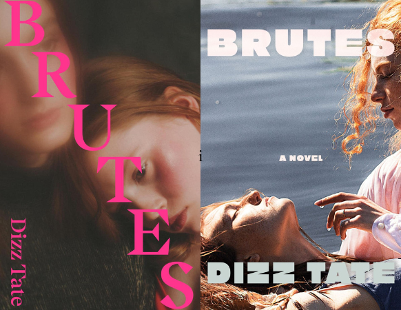
Brutes by Dizz Tate
Set in Falls Landing in Florida, Brutes follows a gang of 13-year-old girls obsessing over the local preacher’s daughter, who has gone missing. This book is unhinged, girlhood nightmare fuel, and apparently both the UK and US cover artists thought photorealism was perfect for the job. On the UK side, we have a slightly blurred photo of two young girls embracing with the title slashed across in all caps. The US side opts for a subtler title layout and a clearer image of the girls in an ocean baptism to highlight the devastating Florida sun. While I love both images, the US cover certainly does inhabit a certain violence in its overexposure (think Dexter’s bright Miami murders), making it perhaps the more apt and popular design for this book.
Winner:
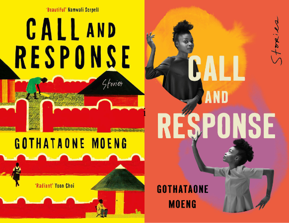
Call and Response by Gothataone Moeng
We have two very different concepts here: while the UK cover appears painted and chooses to focus on the setting of the book—possibly the village of Serowe, where many of the collection’s stories takes place—the US cover opts to focus on characters, depicting two photo cutouts of a woman set against a blob-esque background. There’s something playful about the US cover that I quite like—possibly the fact that while the bottom cut-out looks up at the top cut-out, the top cut-out looks directly at you. The way the cut-outs are positioned as though they are communicating also evokes the title. The UK wins this round however with drawings of people and little houses with triangular roofs against in a bright yellow and red palette. Though Call and Response follows many characters, the stories are all tied to Botswana, which is very much the beating heart of this book.
Winner: 
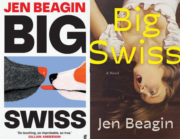
Big Swiss by Jen Beagin
It’s hard to describe Big Swiss, but essentially a sex therapist’s transcriber falls in love with a patient through listening to her sessions. Yeah. I know. Big Swiss is a novel with a lot of personality, and so it is fitting that both the covers follow suit. On the UK side, we have some vaguely suggestive dog action going on–representing, perhaps, the moment the protagonist, Greta, first hears the disembodied voice of her love interest at a dog park. On the US side, we have realism artwork of an upside down woman possibly screaming, possibly orgasming–it’s hard to say. I was really rooting for realism here–I love the drama of it, who doesn’t? But it seems the UK’s subtle, yet cheeky artwork is the winner here.
Winner:

Bellies by Nicola Dinan
Ah, yes. The people have spoken. Sexy fruit is alive and well, and it’s not going anywhere. I am of course referring to the close shot of a peach on the UK cover, which can only be described with one of Bram Stoker’s favorite words: voluptuous. There is also something undoubtedly bold and queer about fruit covers–fitting, considering that the book follows the complicated relationship between a cis man and a trans woman who fell in love pre-transition. That is not to say the US cover holds no merit–smooth vector lines form two bodies sleeping beneath the same covers–suggestive, yes, though not nearly as much as the UK cover. It seems bold and sexy takes this round, as the majority of voters side with the UK.
Winner:

Your Driver is Waiting by Priya Guns
Here we have what the kids call ‘same picture, different font.’ The choice of both covers to depict a rearview mirror makes sense, considering the plot follows a burnt out rideshare driver. But while the UK cover depicts a realistic pencil, possibly charcoal drawing of a woman’s eyes in the mirror, the US’s version uses smooth vector lines, as well as adds in a little burning air freshener swinging from the mirror (just a little foreshadowing, wink wink.) Though the covers are similar, the US version is undoubtedly more unhinged, and we love to see that. It seems the majority of voters also preferred chaos.
Winner:

The Middle Daughter by Chika Unigwe
In the wake of her grief, a woman finds herself trapped in an abusive relationship and estranged from her family. Sounds familiar? The Middle Daughter is something of a modern, Nigerian retelling of Hades and Persephone, in which the lord of the dead famously abducts the goddess of spring (at least, in some versions; myths tend to get a bit iffy.) The UK cover, adorned with dense, lush flowers, helps conjure this myth to mind. The US cover, on the other hand, chooses to focus on characters, and does so with what appears to be subtle collage. It seems voters preferred the flowers this round, adding another win for the UK.
Winner:
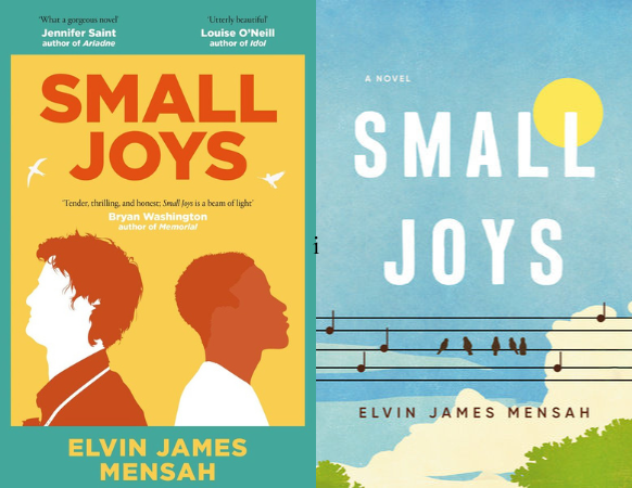
Small Joys by Elvin James Mensah
Though two very different covers, both the US and UK covers have essentially the same vibe: soft, comforting, hopeful, all of which pairs well with Small Joys, a story about a man who develops an unexpected friendship right before he was about to end it all. The styles of the artwork have some differences though. The UK version uses, once again, those clean vector lines, while the US version looks more homemade, almost as if constructed out of tissue paper. What ultimately does it for me, and possibly for a few of our voters, is the very cute detail of the music notes standing like birds on the telephone wires–a hint at the novel’s musical references. Though both covers were great contenders, the US wins this round.
Winner:

Really Good, Actually by Monica Heisey
Really Good, Actually follows a twenty-nine year old divorcee whose marriage disintegrates after a mere 608 days. This story is messy in the best way possible, and the matching cover art of a woman with dripping mascara is perfect for the occasion. When it comes to artistic style, however, our voters have sided with the US’s far more dramatic realism artwork, as opposed to the UK’s vector image. I have to agree. Clean, simple vectors, though modern and trendy, don’t nearly measure up to the detailed chaos the realism cover offers.
Winner:

The Happy Couple by Naoise Dolan
The general layout of these two covers are quite similar, from their font to their minimalistic images. As you might be able to deduce, The Happy Couple follows a decidedly unhappy couple on their way to their wedding. The US cover tackles this plot with an illustration of two swans turning away from each other, while the UK cover goes for a subtler approach, depicting a crumpled tissue lying next to a box of tissues. From our results so far, it seems our voters tend to side with subtlety, and so the UK claims another win.
Winner:

Maame by Jessica George
I personally like covers with people, since the illustration lends itself to a vague image of the protagonist in my mind. If not people, geography is nice too. Or–something. Something related to the book. It seems I am alone in this however, as the majority of voters have sided with the US cover, which–though it features some nice looking flowers–is very much a blob, or at least blob adjacent. I argue that nothing about this artwork actually references the story, which is about a woman’s experience dealing with racism, love, and familial duties. The UK cover, on the other hand, at least appears to depict the protagonist. I’ll admit, though. The flowers are pretty. The palette is eye-catching. And that book would look lovely on my shelf. Sigh. You win this time, blob fans.
Winner:

The Book of Goose by Yiyun Li
For the covers of Yiyun Li’s haunting novel on friendship and memory, birds take center stage. On the UK edition, publishers seem to have leaned towards realism and maximalism, resulting in a busy cover with lots to see and an overall dramatic effect. The fact that so many birds are lying still, possibly dead, is also quite alarming, yet true to the tragic events that occur in this story. The US cover, on the other hand, depicts geese with a simpler, somewhat more minimalist approach, one which evokes the fine, curved strokes one might associate with Paris and the French countryside, where a few of the story’s events occur. While the covers have similar subjects and are both beautifully drawn, it seems more voters prefer the US cover’s style.
Winner:

The Late Americans by Brandon Taylor
Brandon Taylor’s novel about a group of friends in Iowa City is beautifully written, so it is quite fitting that the covers are just as elegant. The US cover has a lot more going on, with broad brush strokes that flood the whole page, depicting two lovers entangled in a kiss. Up close, one might not necessarily identify the image immediately, but there’s something sexy and queer about that, which meshes perfectly with the novel’s plot. The UK cover is quite the contrast, with a largely solid white cover, interrupted by small, realistic and nearly gothic images. There is certainly an understated drama to the UK cover, as well as a touch of light academia, but it seems the US cover’s sensuous, more abstract art wound up charming more voters.
Winner:
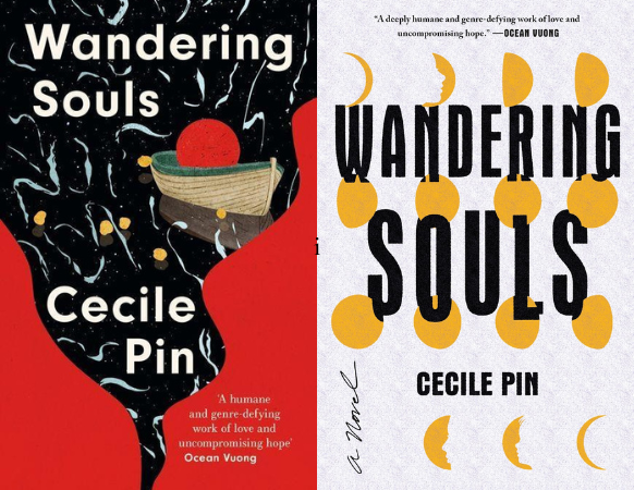
Wandering Souls by Cecile Pin
There is something lonely and timeless about the moon, which is perhaps why it makes such a great cover art subject for a book about three orphaned siblings seeking refuge in the UK following the Vietnam war. The US cover is particularly haunting, cleverly depicting the moon phases partially cut to create face silhouettes out of the negative space. It looks almost as if the faces at the top and bottom are trying to reach each other, or perhaps turn into each other. The UK cover is a bit busier, with a wood boat drifting through dark waters, the red moon appearing to sit inside the boat. My favorite detail about the UK cover would have to be the reflective quality of the dark water, suggesting the little white dots are stars in a dark sky. Perhaps these whimsical details ended up swaying more voters to the UK cover.
Winner:

Pineapple Street by Jenny Jackson
What is this? A tie?! Well, not only is it a tie, but it is a tie in the most chaotic way possible, with the US cover dominating on Instagram and the UK cover winning on Twitter. Our lovely social media editor even double checked, but sure enough, the count was 501 vs. 501. What are the odds! If anything, this might say more about the Instagram vs. Twitter aesthetic than overall reader preferences. On the US side, we have a maximalist, artsy cover depicting fine vases, marble busts, and gold mirrors–perfect for a book featuring New York’s upper class. The UK cover is much simpler, starring a citrus unpeeling before a faint, Manhattan skyline. In a way, it makes sense that picture-oriented Instagram would wind up choosing the busy, maximalist US cover, while Twitter, formerly known for its 140 word limit, prefers the minimalist approach.
Winner: Tie!

Monsters by Claire Dederer
Yes, let’s get some nonfiction up in here! Claire Dederer does not hold back in her deep dive on problematic artists, ranging from Picasso to Woody Allen, so it makes sense that both covers are equally as bold. On the US side, we have a photo image of a man in swim trunks with his head hidden by a large bull mask. I do not know how to describe his pose other than that he looks mid-mansplain. I mean, look at those hands. Tell me those aren’t mansplaining hands. On the UK side, we have clever artwork of two girls clutching their heads and screaming, either in pain or sheer euphoria. Having witnessed my fair share of boy band concerts, I’m inclined to say both. If I may add, I think these two images actually work quite well next to each other, the US cover giving a subject for the girls on the UK cover to scream at. If forced to choose just one, though, it seems the majority of voters sided with the UK cover.
Winner:

The Guest by Emma Cline
The Guest follows twenty-two year old Alex who grifts her way through life after being dumped by her rich, older boyfriend Simon. Even without knowing the plot, you can probably sense there is something nefarious and voyeuristic to the story. While the UK cover offers a photo image of a glowing, aqua pool at night, the water ominously empty, the US cover depicts only a single, extended hand, the entire image saturated in blue and green. Coupled with the title, the US cover certainly paints an unsettling image, which may have ultimately swayed more voters to the US side.
Winner:

How to Think Like a Woman by Regan Penaluna
How to Think Like a Woman, which spotlights the lives of 17th and 18th century female philosophers that have been forgotten by history, aptly chooses portraits of women as the star of their covers. The UK cover is a bit more abstract and shape oriented, the subject’s dark eyes appearing to stare into your very soul. The US cover goes for a realism approach and features a woman holding a book, her face swathed in white cloth, obscuring her identity entirely. There is no arguing that both covers are stunning and startling. Thematically, however, the US cover aligns better with the book, possibly giving it the nudge it needed to win.
Winner:

I Have Some Questions for You by Rebecca Makkai
Here we have two covers which differ in just about every way. The US cover tackles Rebecca Makkai’s mystery about a campus murder with shaky letters that appear to bleed across a red and blue background. The UK cover chooses to focus on images, with a series of rectangular snapshots that bring to mind evidence from a crime scene. It seems the images resonated with more voters, and thus the UK cover takes the penultimate round.
Winner:

White Cat, Black Dog by Kelly Link
And, last but not least, White Cat, Black Dog. Kelly Link adopts classic fairytale stories and turns them into her own in this genre-bending short story collection. It is unsurprising, considering the title, that both covers feature animals. While the US cover opts for a cute little puppy, the UK edition depicts–uh–a slightly more unsettling pair of animals. My, are those sharp teeth! Nonetheless, while the US edition’s dog might be cuddlier, there is certainly a fairy tale vibe to the UK edition’s art, which fits perfectly with the overall theme of Kelly Link’s collection.
Winner:
The post The Battle of the Book Cover: Britain vs America appeared first on Electric Literature.