Over the past few years, there’s been a lot of heated discourse surrounding a trend in book covers in which many new releases opt for variations of the same colorful abstractions: The Blob. Somehow deemed appropriate for everything from dystopian debuts to literary fiction bestsellers, these indiscernible “blobs of suggestive colors,” as The Week coins them, clearly make for a successful marketing strategy. However, the unintended consequence of making these incredibly varied books appear similar, is that readers are left with little insight into the characters, general mood, or topics a book explores.
We wanted to look at some of our favorite book covers of 2021 from the U.S. and across the pond, hoping to find something beyond the bright blobs. Do readers still respond to abstraction and pigmented color palettes? Is realism making a comeback? To tackle these Very Serious Literary Inquiries, we polled our Instagram followers to discover what they like best. With British versions on the left and American takes on the right, read on to start judging some books by their covers and see what’s resonating with our audience.
Crying in H Mart by Michelle Zauner
While both covers are doing similar things—bright red background, line-art-heavy illustration, food imagery—something is pulling readers towards the American cover’s slightly bolder noodle depiction. Zauner’s memoir is a story of her finding and accepting her identity, from growing up Korean American in Oregon and losing her mother to tackling the role of food in her culture and life. Perhaps it’s the tension of the noodle pull or a font that seems a bit rawer, but readers clearly think the U.S. rendition is the tastier of the two.

The Death of Vivek Oji by Akwaeke Emezi
The suggestive color blob is a clear winner when it comes to packaging the heart-wrenching story of Vivek Oji, a character who grows up in southeastern Nigeria. The blobs are at least identifiable, perhaps depicting Vivek’s long, grown out hair braided into his cousin Osita’s, with whom he has a close bond. The need for connection, for closeness, is at the heart of this story, where Vivek’s suffering stems from being misunderstood by his loved ones and wider community. Emezi has published prolifically these past few years, and this cover stands out from the previous, more muted color palettes of their Freshwater, Dear Senthuran, and Pet. Clearly, the bold approach is working, especially when paired against the beige realism of the U.K. cover, which reads more like nonfiction to me.

Burnt Sugar by Avni Doshi
The U.S. is on a roll, dominating once again with nearly 70 percent of the votes for the Booker Prize shortlisted Burnt Sugar. The U.K. cover’s use of color feels all over the place when compared to its paired down American counterpart. The plant looks like aloe, the juxtaposition between spiked leaves and healing properties hinting at the tensions within this mother-daughter story, in which a daughter must care for her free-spirited elderly mother despite her mother’s selfishness and negligence throughout her childhood. Illustrated book covers without pictures of people have appealed widely in the past decade, and in this instance, that continues to feel true.

Popisho by Leone Ross
While both covers are colorful and abstract, the greater clarity of the U.S. version makes for a clear winner. Popisho’s cover gives so much more of the story away—the island setting, the magical realism, the mythical characters, perhaps even the sociopolitical tensions explored. While I think the British title might actually appeal more as readers can imagine the whimsy and fantastic nature of a “sky day,” its inability to hint at the plot visually renders this blob of suggestive colors unsuccessful.

How Beautiful We Were by Imbolo Mbue
The Brits have entered the competition! With a narrow margin, the brightly drawn U.K. cover excels over the stoic and photographic black and white American take. While I love the crisp and haunting marbled arms, one cannot deny that the U.K. version does far more storytelling work. The illustration captures the tension between the environment and an American oil company with the vines seeming almost cleared away to glance at this oil field, the haunting figure caught in the middle. For a book where the fictional setting of African village Kosawa is so key, this scene seems an appropriate introduction to the story.

Matrix by Lauren Groff
Our readers seem to like both of these images with almost equal fervor. For an imagined telling of real-life poet Marie de France’s life in which she serves as an abbess for a 12th-century nunnery, the U.K. version squeaks out a victory at 52 percent and it is easy to see why. The illustrated nuns reading or praying are not only sweetly rendered, but speak to a sense of community integral to the story or even the evolving nature of Marie’s role at the nunnery. The bold colors prove transcendent and just a touch more eye-catching than the dreamy, almost Renaissance ceiling style of the U.S. cover, which opts for a more muted version of the blue and gold color palette.

Wayward by Dana Spiotta
With an apparently rare win for realism, the U.K. cover dominated, and I wholeheartedly agree. In this story of a wife and mother who walks out of her life following the 2016 election, the maudlin interior and stray, lamenting arm perfectly capture the moment of crisis and unraveling this book unpacks. Although both covers hint at the idea of a home—crucial in a book that kicks off with Samantha buying a deteriorating house in Upstate New York on a whim, before she has even left her husband or home—the U.S. version could be celebrating first home ownership with its bright hues and celebratorily hung keyset. The left side allows us to empathize with someone rooted in a place—a political landscape, an aging body, an expected role—that she doesn’t want to be in and that is the work of a successful piece of art.

Love in the Big City by Sang Young Park, translated by Anton Hur
It is as easy to fall in love with the details of the U.K. cover as it is the characters in Park’s English language debut. The Marlboro reds and raining boba hint at the book’s exploration of a youthful existence spent in motion, pleasure seeking. While the American rendition shows us the chaos of Seoul and the desire for connection, that work is already being done by the title. The U.K. is simply more generous and specific, prepping us for the complexity and all-consuming nature of a queer, millennial existence, equal parts loneliness and joy.

Nightbitch by Rachel Yoder
After a British winning streak, the Americans attempt a comeback with the graphic glory of Nightbitch. An artist with an absent husband feels lonely and unfulfilled in her new role as a mother and begins to transform into a dog— either evolution or deterioration. This feminist take on modern motherhood refuses to look away from the raw, bloody realities of what women are forced to endure, how they are expected to sacrifice and transform, and the consequences of those restraints. The American cover aptly blends the realism of the meat of this story with the suggestion of the dog, the animalistic and fantastic avenue through which this emotional heart is delivered.

100 Boyfriends by Brontez Purnell
The humor and heart of this expansive exploration of gay men’s tendency to self-sabotage comes across perfectly in the drawn American cover. The heart and lifelines on this hand suggest a kind of palm reading, promising us intimate and honest access to these characters and their stories. This playful image transcends the relative unimaginativeness of the British take, which seems a little boring and expected. It feels like it came from the very first day of the design meetings: How do we signal queerness? Let’s make the cover pink. How do we get at the breadth of experience? Let’s collage a bunch of pictures. What about the depth of emotion? Make them black and white. Great, fast-track this to production. There’s just a little more of the book’s magic in the U.S. edition.
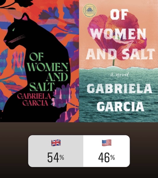
Of Women And Salt by Gabriela Garcia
Personally, I think each of these covers is beautiful and readers seem similarly split. Both have a powerful but feminine energy to them that sets up this expansive, intergenerational saga of women. Because the book takes us between 19th century Cuba, 1950s Mexico, and modern-day Miami, the sense of place has to remain a bit abstract and the cover must instead indulge in the feeling of the story; the panther pleasantly suggests some sort of feminine pushback—readers just have to indulge to find out it is against the tyranny of men, oppressive regimes, and immigration policies.

The Slaughterman’s Daughter by Yaniv Iczkovits, translated by Orr Scharf
There is so much whimsy decoration in the U.K. cover for this historical adventure novel and in this case, more is more. The disappearance of a wife and mother in late 19th-century Tsarist Russia makes for an epic tale, and the intricacy of the British illustration hints at the classic style of this story (think War and Peace) while remaining lighthearted enough to assure readers of its accessibility.

The Woman in the Purple Skirt by Natsuko Imamura, translated by Lucy North
In the closest vote of the bunch, the U.K. just barely claims a victory here and I think it is for all the right reasons. The reserved colors, the unsettling lack of a face, the voyeuristic vantage point—it is all spot on for this highly psychological undertaking. The unseen housekeeper, the Woman in the Yellow Cardigan, observes and subtly manipulates the Woman in the Purple Skirt as she has an affair with her boss, crafting a powerful reflection on power in the workplace and what it means to be seen and/or desired.

The Dangers of Smoking in Bed by Mariana Enriquez, translated by Megan McDowell
It can be especially hard to design a cover for short story collections, but I actually think both countries nailed this one. Merciless, horrific, and unnerving, the dark background and bold illustration of both looks seem to universally work for readers. Perhaps the U.K. edged out a win for its slightly more modern look, almost magazine-like as it markets uneasy, allegorical stories of women and witches, homemade porn and homeless ghosts, among a sea of other unflinching and haunting plot points and characters.

The Weak Spot by Lucie Elven
Americans have the clear winner here and I think it comes down to, as Brandon Taylor might say, the vibes. The Brits went for a more dated look, from the old-timey illustration to the generic font, while the U.S. version seems a little more confident and arresting. A pharmacy on a remote mountaintop is a strange setting made even stranger by the confession-like role it plays for locals who come with stories and seek spiritual healing as much as physical remedies; the mysterious green structure more accurately hints at that kind of surreal space. It also is oddly reminiscent of Sheila Heti’s Pure Colour, so maybe the all-too-popular vague color bomb will be overshadowed by a new era of single-colored abstractions.

Little Scratch by Rebecca Watson
Although another close call, the U.S. cover and its endless thumbtacks takes the cake this round. I think the American cover is doing a lot—it plays with the title while simultaneously getting at the feelings of both a generic office space and an anxious headspace. The novel covers 24 hours in the mind of a young, female worker who has recently been sexually assaulted, balancing the profundities of human emotion with the mundanity of an office to explore how the mind works through a trauma. While the U.K. cover similarly conjures up the workplace with its crumbled-up yellow paper, perhaps the line-art is too cold and generic for a story that plays with form so innovatively and grapples with this #MeToo moment without losing its sense of humor.

At Night All Blood is Black by David Diop, translated by Anna Moschovakis
The American cover is quite simply the cooler of these two. I feel like I’ve seen the U.K. version before, and it veers too close to colorful blob territory. Instead of any old soldier, the U.S. version gives us this severed hand, a crucial plot point, that looks enchanted or as if it is being showered in bullets. All of this to say, the American version actually speaks to this specific story of a Senegalese man called to fight with the French army during WWI as his trauma leads to strange and violent behavior that ends up putting a target on his back. The U.K. version gives us generic blue blobs and a soldier, so the points are clearly for creativity here!

Writers & Lovers by Lily King
Another clear American winner comes down to originality. I don’t feel as if I’ve seen the U.S. cover before with its still life qualities and juxtaposed color scheme. The U.K. version, on the other hand, feels like every rom-com cover from the last ten years. It might even do a disservice to the literary nature of this novel about navigating writing and grief and capitalism and love in your early 30s.

Who is Maud Dixon? by Alexandra Andrews
When an unsatisfied publishing company assistant gets the chance to potentially assume the identity of a mysterious and successful novelist, she just might take it. I like the anonymity of the American cover and how one line extends into two faces, asking readers where we draw the line between right and wrong or our inner lives and public persona. The U.K. cover has a certain warmth to it, but once again, realistic faces seem to deter the literarily minded.

Hot Stew by Fiona Mozley
While the U.K. cover delivers pretty literally in hinting at both sex work and the London Soho locale, there’s definitely more charm and character to the winning American cover. In a story about gentrification, ownership, class, and agency, there’s a certain playfulness to the American rendition. It employs what looks like aristocratic art to touch on ideas of the extreme upper class and their often-unsympathetic view of capitalism’s victims, apparently ranging from exploited and marginalized people to the unsuspecting swan these expensive hunting dogs are set upon.
The post Which Book Cover Looks Better, the British or American Version? appeared first on Electric Literature.
Source : Which Book Cover Looks Better, the British or American Version?