Google Sheets lets you generate charts automatically to create a visually appealing way to convey information. Using charts is a great way to help people retain data a lot easier than looking at a bunch of numbers.
Google Sheets gives you a wide variety of free graphs from which to choose. Whether you want to use a pie chart or something a little more complicated like a radar chart, you won’t be disappointed with the options available.
The first thing you need to do is fire up your Google Sheets homepage and open a new or existing spreadsheet.
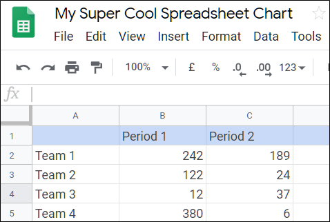
If you just opened a new spreadsheet, now would be a good time to insert some data into the cells. After that, click “Insert” and then “Chart.”

From the drop-down list, click the type of chart you want to add. In this example, we are going to use a smooth line chart, but you can choose from 30 different types of charts.

Read the remaining 19 paragraphs
Source : How to Automatically Generate Charts in Google Sheets