Pie charts are popular in Excel, but they are limited. You’ll have to decide for yourself between using multiple pie charts or giving up some flexibility in favor of readability by combining them. If you do want to combine them, here’s how.
For example, the pie chart below shows the answers of people to a question.

This is fine, but it can be complicated if you have multiple Pie charts.
Pie charts can only show one series of values. So if you have multiple series, and you want to present data with pie charts, you need multiple pie charts.
The image below shows the contribution to total revenues of five products across three different cities. We have a pie chart for each city with the data ranges shown above them.
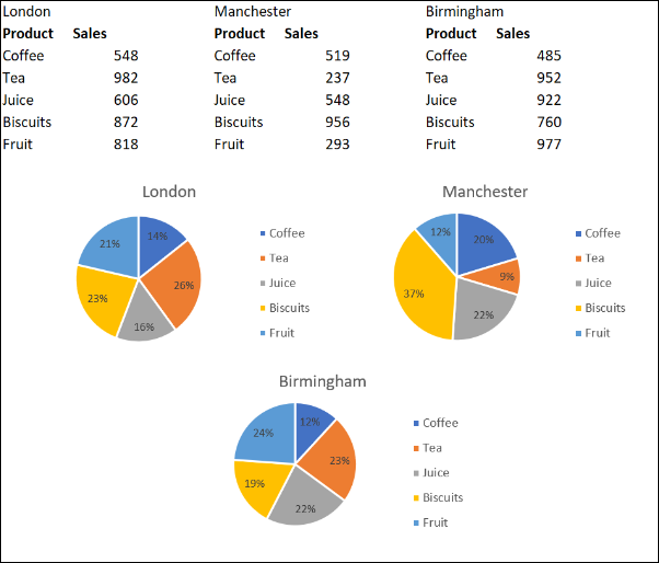
This enables us to compare the sales of products across different cities. But there are complications when we want to change them all consistently, or view them as a single figure.
Read the remaining 45 paragraphs
Source : How to Combine or Group Pie Charts in Microsoft Excel